Something New for 2022
I’ve been working for several weeks on a new logo for mellBella Photography. This will be the third edition of the logo since the mellBella brand was officially founded The name mellBella includes my name, BUT I didn’t want it to be just me. Bella is a nod to the Italian roots of my husband’s family who started Richard Bell Photography who gave me my start in photography. PLUS, Bella means beautiful. The first version of the logo was retro feeling, and of course the B was capitalized. Our colors were hot pink, black, and silver.
She was a good logo and the B changed colors to red and purple depending on the photo shoot too. However in 2017, we changed to something more flowy, modern, and sleek. It took some time to find the right fonts and color, but she was professional, curvy, and cute. 
BUT over the last few years, mellBella Photography has grown in so many ways, and this logo didn’t fit the brand anymore. mellBella is so much more than professional, curvy, and cute. Soooooooo much more than where we started…. the logo needed to be more and different. So in February, I emailed my designer, Andy, who is also a Bell, to figure out a new look. It had to FEEL just right. For the record, it’s really hard to describe something that you can’t picture in your head as the final look but you have lots of ideas, feelings, and an instinct that go into it. I’m so thankful to Andy for helping me through this process, listening, and translating it ALL into an actual design.
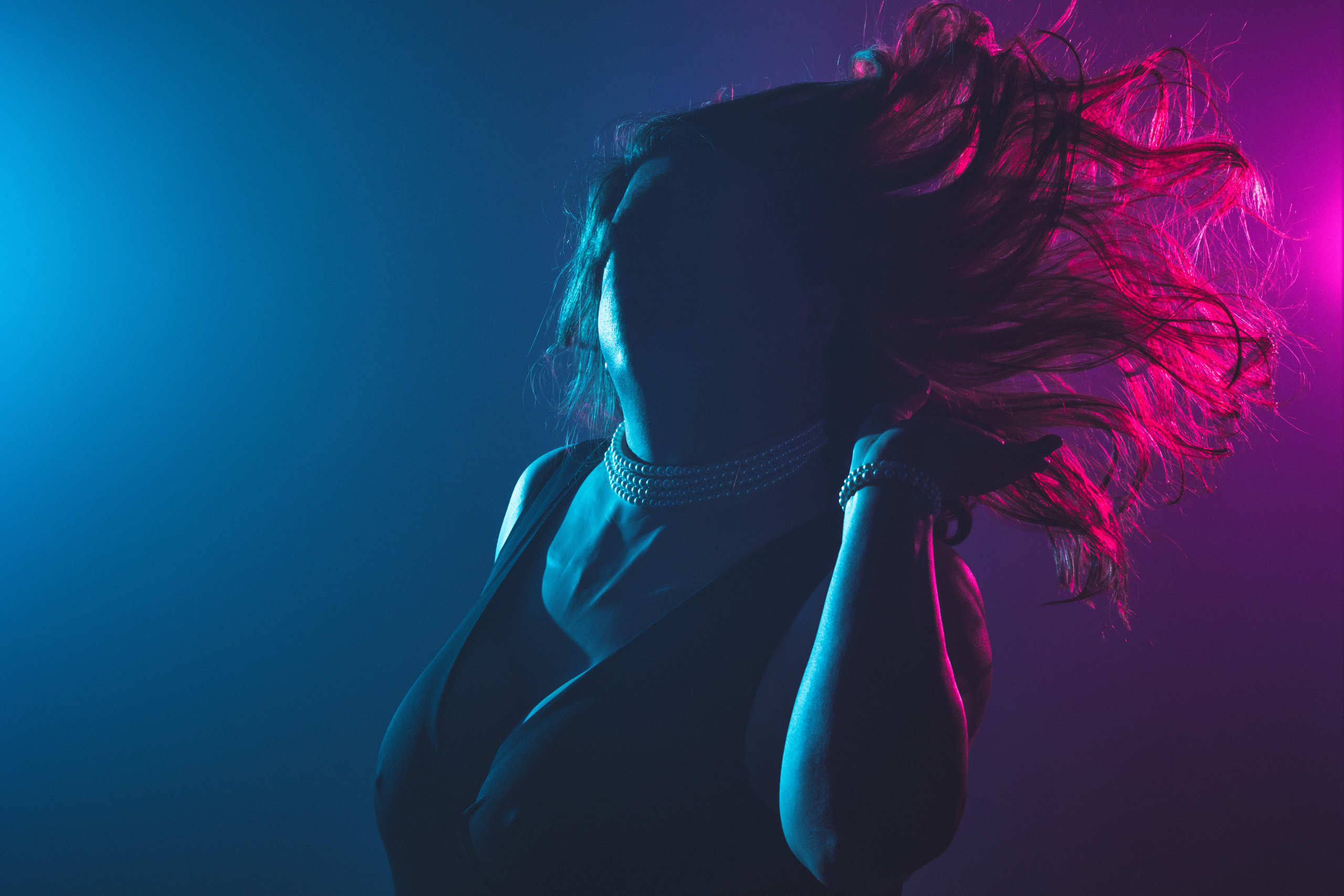
This portrait was the INSPIRATION behind our new logo. For her most recent shoot in December 2021, she asked if we could do some images with bisexual lighting. This lighting incorporates a blue gel and a magenta gel and where they meet creates purple lighting. The colors are on the bisexual flag, give an 80s retrowave vibe, the three main hair colors I’ve had in recent years, AND are used throughout tv shows and movies as well. And if you know me, you know I love to PLAY with LIGHTING and COLOR.
This lovely woman has trusted me to photograph her and embrace who she is. She gave me permission to share this image without her face and a few details about her story. She was my very first trans client, and she even used the photos we created from her first portrait session to come out to her mother. Wow, just wow. I’m so grateful to her because trans people face high levels of discrimination and violence, AND she’s not alone. To be clear, trans rights are human rights. She is inspiring… watching her confidence and comfort in herself grow over the years is indescribably beautiful. Of course, there’s SO MUCH MORE to it all… so much more detail, history, struggle, growth, and most importantly, LOVE. SHE is the phenomenal muse behind the new logo.
The new logo is dedicated to-
- The FANTASTIC woman in the above photo, of course.
- ALL of my clients (past, present, and future) whose trust I value immensely.
- The awkward, the in-between, those who have been told they’re less than, those who have been told they’re too much, those who feel out-of-place, and those who are still figuring it out.
- Creating, Collaborating, and Caring.
- Being a Whole Ass Person.
Check out the NEW look in the video below-
I wanted a logo that would be….
- Slightly more modern but not stiff; still curvaceous
- Upscale, high end but still relatable and friendly with some whimsy
- NOT perfect
- Vibrant, Bold, Fun
- Androgynous, Feminine, and Masculine
- A gradient of colors
- Enchanting, Welcoming, and Balance
- Something that feels like me
- Something that when you look at it doesn’t look nor feel like every other photographer out there
I was finally diagnosed with ADHD later in life, so I lived most of my life feeling Out-of-Place without understanding who I am. I felt Awkward, Too Loud, Too Random, Out-of-Place, Weird and Clumsy in my Brain and Body, Forgetful, Lazy, and Not Good Enough. BUT as a child, I would watch Mr. Rogers Neighborhood, and I always knew that Mr. Rogers liked me exactly as I am. No qualifications… no buts…. just how I am. Growing up, I wondered so many times– IF I was loved by my mother, IF I was unlovable, IF I could do anything right, IF I could ever decide what I wanted to do with my life, IF I was good enough, IF I can change myself enough to fit in, IF… IF… IF!!! I think that’s why the following quote is a huge part of my values:
“You are a very special person. There is only one like you in the whole world. There’s never been anyone exactly like you before, and there will never be again. Only you. And people can like you exactly as you are.” -Mr. Fred Rogers
This new logo feels right… it feels fitting… it feels like it reflects the changes and growth in mellBella Photography. It feels retro and modern. It feels masculine, feminine, and androgynous. It feels welcoming and fun but serious and professional. It’s a balance and whimsical.
My goal is for the art I create with my clients to show:
“As human beings, our job in life is to help people realize how rare and valuable each one of us really is, that each of us has something that no one else has or ever will have something inside that is unique to all time. It’s our job to encourage each other to discover that uniqueness and to provide ways of developing its expression.” -Mr. Fred Rogers
So….. what’s next? The website. It’s a process, but it will be worth it.


 © mellBella Photography, 2021